UX/UI Writing Portfolio
Redesigning UOB Personal Internet Banking
Client: UOB
Challenge
UOB Personal Internet Banking was first built a decade ago, before the current MAS expectations around informed consent, step-up authentication and plain-language disclosure. The legacy banking portal lacked contextual guidance or timely prompts to help customers recognise what they were authorising, even for high-risk actions.
Status updates, errors and next steps were communicated through technical system messages. This turned routine requests into contact centre calls that were expensive for the bank and frustrating for customers.
Solution
The revamp of UOB Personal Internet Banking establishes a consistent content and interaction pattern across the portal. For higher-risk transactions, content is designed to introduce friction and interrupt the pattern.
Microcopy is rewritten in plain language to reduce ambiguity throughout the journey. Error messages explain what happened and what customers can do next, while contextual warnings allow customers to make informed decisions. As such, the interface becomes a safeguard, flagging risk and confirming intent before transactions move forward.
Simplifying Shopee’s Online Selling Experience
Client: Shopee
Challenge
Shopee’s seller base is as diverse as the Asia-Pacific region it serves, ranging from home bakers in Indonesia to craftsmen in China. Many prospective sellers have limited digital literacy and are unfamiliar with e-commerce platforms.
To support regional seller acquisition, the Education Hub needed to make learning approachable and easy to follow, regardless of a seller's background, language or level of experience. Complex business topics also had to be communicated consistently across multiple markets and languages.
Solution
The Seller Education Hub breaks learning into bite-sized, step-by-step courses supported by videos, animations and interactive elements. Content is written in a friendly, conversational tone, with technical jargon replaced by everyday language to make topics such as logistics and financial management easier to understand.
Lessons are structured for localisation across seven languages while maintaining consistency and clarity. The final experience is welcoming, digestible, and purpose-built to empower sellers of all backgrounds to join Shopee.

Crafting the Brand Narrative of a Creative Agency
Client: Inkwell Creative
Challenge
Many creative agencies position themselves using broad, interchangeable language that highlights creativity, innovation, or quality without expressing what truly sets them apart.
This often results in messaging that feels generic, making it difficult for clients to understand the agency's unique perspective or approach.
Solution
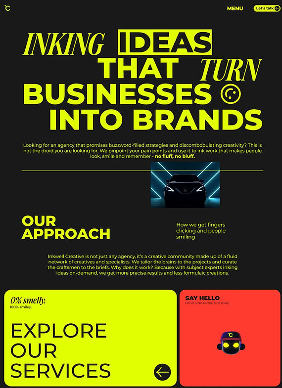
Inkwell Creative’s website is crafted to shift the narrative from delivering creative assets, to focusing on the people those outputs are intended to serve.
By focusing on empathy and people-centred experiences, it communicates that every piece of work is grounded in understanding real needs and emotions. This positions the agency as one that creates genuine connections, solves real pain points, and have fun doing it.
Translating Data into Actions
Client: Detalytics
Challenge
Detalytics 42 is a health app that takes a scientific approach to unlocking peak physical and mental performance. The challenge was translating complex health research and medical terminology into an experience that felt accessible without compromising accuracy. This meant demystifying scientific concepts and designing a user journey that was intuitive and easy to navigate.
Solution
The app begins by anchoring the user journey around personal goals, whether it's staying healthy during pregnancy, lowering the risk of illness, or preventing jet lag. This is followed by a short quiz to gather the information needed for personalised recommendations. Insights are translated into actionable guidance using plain language and step-by-step content. By prioritising clarity over complexity, the app makes evidence-based health guidance easier to understand and apply in everyday life.

Streamlining the Journey to Conversion
Client: Singtel

Challenge
Singtel's 5G+ Enterprise Mobile Plans introduced advanced connectivity features that could be difficult for business customers to evaluate at a glance. Thus, we needed to communicate the benefits of next-generation mobile technology to business decision-makers in a plain, accessible manner, and do it within a self-service journey built for busy professionals.
Solution
The UX content is designed to move users from interest to intent as quickly as possible. Instead of asking customers to wade through specifications, plans are reframed around business outcomes using benefit-led language that reduced cognitive load. A modular comparison format makes differences easy to scan, while action-oriented CTAs let users self-select and purchase with confidence, minimising the effort required to convert.
By reframing technical details into outcome-driven language, the solution shortens the path from consideration to purchase, while supporting Singtel's broader goal of a frictionless, self-serve enterprise channel.